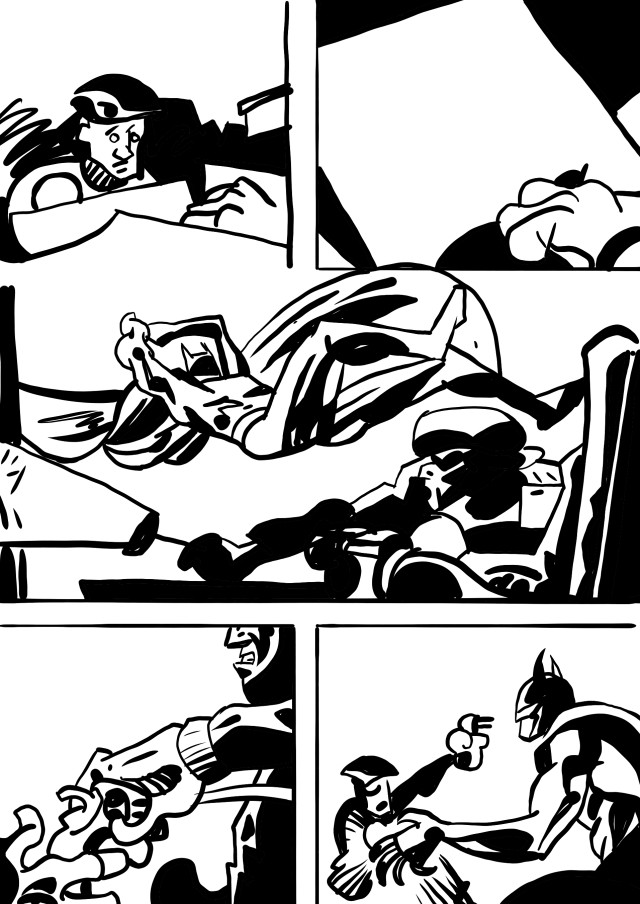
The figure’s scale on the page is one way to define an important moment. With Robbins, a third of every panel is filled with captions and word balloons at least. The lack of extreme jumps in scale makes the page feel anemic. A large scale close up of the thief’s face would help identify with him, develop a little empathy, and pull us into his story.
There’s a gun for shock but it’s a little gun on the page. Graphically it’s not much of a threat to the thief and the lines from the flashlight overwhelm it space wise. As the thief staggers back from the dead man he’s cropped out of the panel and just the gun is floating there. My pencils don’t work as it’s not about the values but the way Robbins designs with black that makes his pages compelling. When the last panel reveals that the gun-holder is dead it’s done in words not actual action by the thief.
The visual weight of the two panels in the middle tier is almost the same an almost complete horizontal with the figure staggering back. While it’s a shot reverse shot the force of the gesture isn’t big enough because the 2nd figure is so small scale. This was drawn in the tactful old days, no bullet-riddled head with splatters of skull and brain in close up.
Perhaps here as the thief tells us the guy in the chair is dead, a close up would have made more sense.
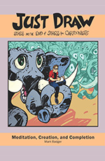
Teaching of course is great for learning what you want to do. I created Just Draw to lay out the lessons for myself when I get lost. It’s how to get back onto the path of making comics and not being grumpy. It’s available on
Amazon here or you can check out the preview. If you’re interested in a class in comics I’m working on an eight-week one to take place in San Francisco at Mission Comics. There will be an online version too for people who are outside of the Bay Area. if you’re interested please sign up for the mailing list to be informed when the class launches.