Categories
Teaching

OOPS! Color and line make comics sort of.

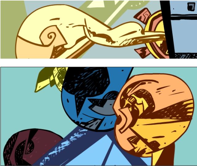
Abstract Kirby is an experiment in making all the ghosts of artists past floating in my head into one comic. It also is, panel by panel silencing of the editorial sniping, the limited view of comics as one thing the way the person-in-power likes it. Letting go of all the stupid editorial voices in my head has been a practiced almost daily ritual. Feeling comfortable with the drawing I’ve started making comics that look the way I want to enough to adding color to the work.

04_oops_03a

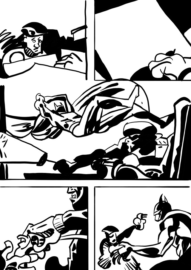
A friend asked to purchase a page. So I printed a pdf from Adobe Flash. Sent it off and she picked a page from it when it came back. Except that Flash had destroyed all the line because when you treat the objects in Flash to their filters Adobe Acrobat can’t render them correctly into a PDF. She got something that looked like this.

04_oops_01

I quickly jiggered the process to send her the correct images. But then the flat color stuck in my head like some evil super-villain that can’t be destroyed. So now what do I do?

04_oops_01a

Clear-line is a European style that grew out of Herge’s Tin-Tin. People were drawn in simple forms without heavy details. The spaces were drawn with correct perspective and with just enough information to tell you things where. No flashy cross hatch no dramatic lighting. Just line drawings defining what it is. One of my first teachers laid that out for me in art school. Even now the goal of that pure simple line is floating in my head.

04_oops_02

Fat blacks laid in over a line drawing and cross hatching for value indicate light. In abstraction, they develop and reinforce shapes making you continually question what an artist wants as shape and line in a composition. In comics the use of a brush and the line drawing was the dominant way to get the hand into the image, tracking the artist and making the artist have a feel. Walter Simonson’s line differs from Craig Russell’s differs from Jose Munoz. I’ve alway enjoyed the play of drawing as you develop layers of cross hatch on top of each other.

But now I have to figure out how to handle my oops.
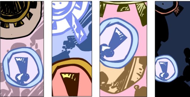
04_oops_02a


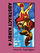
Abstract Kirby 4 cover thumb

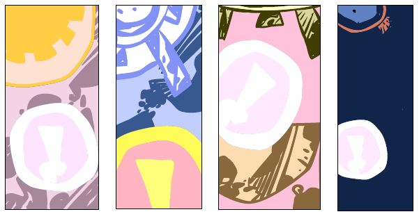
The finest comics I’ve ever done exploring the fundamental things that make comics comics. Now with fancy four colors added into the mix, the tension is can the flat hard colors defeat the evils of cross-hatch and the washes of watercolor lapping at their edges. Or some such bullshit, I like these. Please buy them here, Abstract Kirby 4 on Amazon.
Categories
Teaching

Scale make dynamics in a page

tec_426__04

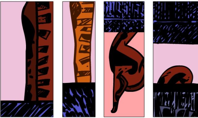
To build a dynamic page you need contrast in the shapes between panels. Putting the same scale of shapes next to each other panel after panel leads to dull comics. Robbin’s make the Thief’s hand and gun almost exactly the same size in the first two panels. Then Batman jumps from a small figure to a full panel side head. The spatial relationship between Bats and the thief feels all screwed up in the cut between the two panels. So the large scale Batman head just feels kind of funky. Even just leaving all the blacks off the hand in the first panel would have made a difference in this shot reverse shot.

Categories
Teaching

Robbins just isn’t a brushy Kirby #2

tec_426__03b

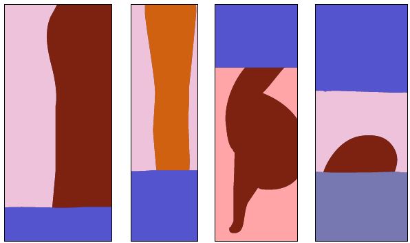
This is a flattened Robbins page to see if I can find the design of the page underneath it. Jack’s use of 2-d design and three-d space is what makes his work unique. Working within his grid Jack would consider the flat shape based design of the page along with the space he was creating. Kirby often seemed to set up suspense that could be carried visually in a page.
Kirby considered each page as a scene with a beginning middle and end that could be told visually.

Categories
Daily Robbins

Robbins lack of scale

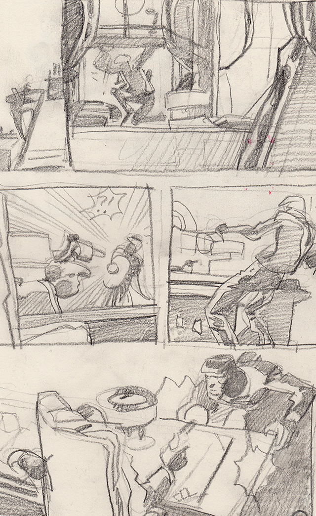
tec_426__02

The figure’s scale on the page is one way to define an important moment. With Robbins, a third of every panel is filled with captions and word balloons at least. The lack of extreme jumps in scale makes the page feel anemic. A large scale close up of the thief’s face would help identify with him, develop a little empathy, and pull us into his story.

There’s a gun for shock but it’s a little gun on the page. Graphically it’s not much of a threat to the thief and the lines from the flashlight overwhelm it space wise. As the thief staggers back from the dead man he’s cropped out of the panel and just the gun is floating there. My pencils don’t work as it’s not about the values but the way Robbins designs with black that makes his pages compelling. When the last panel reveals that the gun-holder is dead it’s done in words not actual action by the thief.

The visual weight of the two panels in the middle tier is almost the same an almost complete horizontal with the figure staggering back. While it’s a shot reverse shot the force of the gesture isn’t big enough because the 2nd figure is so small scale. This was drawn in the tactful old days, no bullet-riddled head with splatters of skull and brain in close up.

Perhaps here as the thief tells us the guy in the chair is dead, a close up would have made more sense.


just_draw_cover_thumb

Teaching of course is great for learning what you want to do. I created Just Draw to lay out the lessons for myself when I get lost. It’s how to get back onto the path of making comics and not being grumpy. It’s available on Amazon here or you can check out the preview. If you’re interested in a class in comics I’m working on an eight-week one to take place in San Francisco at Mission Comics. There will be an online version too for people who are outside of the Bay Area. if you’re interested please sign up for the mailing list to be informed when the class launches.