Categories
Abstract Comics Comics

Cleveland’s Mondrian, is it Comics?

Looking at Mondrian I’ve often thought, “he’s the greatest comic book artist ever”. On Twitter Alan Haverholm (@haverholm) has started claiming many modern paintings as #comics. It’s delightful to have someone else claim Modernism as comics. When he posted a Mondrian grid with lots of squares done in very light values of the standard red yellow blue pallette Mondrian uses, as a #comics. Without thinking I responded #notcomics and said: “Mondrian’s work always comes down to icons for me”.

He didn’t get it. I’m not sure I get it either, so here are some thoughts to think this thru.

I’ve puzzled over this Mondrian at the Cleveland Museum of Art puzzling over why it doesn’t feel like comics to me.
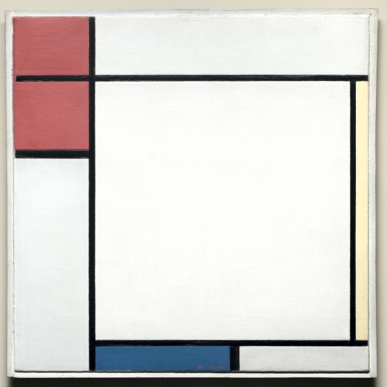
What holds a comics page together as a visual unit that feels different then Mondrian’s grid-based paintings? Mondrian has put his color rectangles at the edges, making your eye move around the central white icon. For each rectangle to make sense they have to be seen in relationship to the others. Certainly not being a sequence makes it not comics. But then I’m not sure sequence is a defining part of a comics page.

The black “gutters” are zips, the weight of each one is set by the others. The thick black bar between the blue and white rectangles by its thickness takes on an identity of its own as almost an anchor of the whole composition. The bar at the bottom of the two red rectangles also take on its own identity and makes you look at it’s two parallel zip.

Despite the immaculate craft of Mondrian’s painting you can’t pull out and make any one rectangle be a “panel”. You have to hold the whole painting in your head as you look at it and can’t fall into any one panel for the meaning in the panel. I think there are two different relationships between parts of a “paintings” and “comics”. In paintings, it’s the relationships between all the parts. In comics, it’s the framework holding all the parts together. But there is still a relationship between all the parts.

So to make a Mondrian into a comic there needs to be a visual framework to allow you to compare the red and blue squares. But what he does is ask you to hold them in your head together in a relationship with the black lines as parts of this relationship, not just a framework.

Next a page from my Martian Manhunter to look more at these ideas.
Categories
Abstract Comics Comics

Teaching Comics to Myself: Fundamentals

Good instruction and good teaching do not provide explanations. They tell you what to do and, to a certain extent, how to do it, and it is through the doing that you discover how the practice works.

Ken Macleod

There are two parts of comics, drawing and storytelling.
But pulling comics apart to understand and develop the work from the foundation is rarely done.
Doing abstract comics takes you closer to the basics of what makes comics a medium and not just illustration.
After doing a month of Abstract Comics for Inktober I found myself wanting to reduce the comics down another step to really understand how panels fit images together.

I recently bought a book on Joseph Albers’ teaching.
Albers is a painter who taught at the Bauhaus and Yale more or less invented the modern educational system for art in the last century.
All first-year color theory and how to learn it by experiencing it is driven by his book The Interaction of Color.
At Parsons School of Design a couple of my first year teachers had studied with him.
These were the ones who cracked my dumb little skull open and poured in a whole new body of knowledge about making pictures.
The made us look at what was actually happening with the lines, shapes and colors put down on the page.
They developed a critical vocabulary for talking about the form of the art and not just what cool things we had drawn.

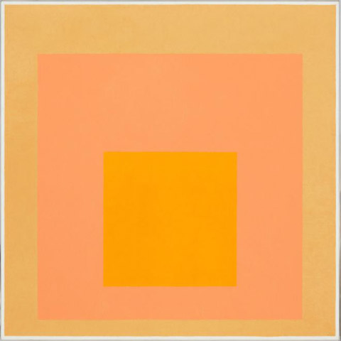
Alber’s last thirty years of his life was spent painting the Homage to the Square, just color in a series of centered squares.
Color is the most complex part of picture making as it can carry more emotion than almost any other part of a visual.
Each painting is just a set of colors that are carefully mixed and create a different painting each time.
Even if it’s just a set of squares set inside of each other.
These are some of the most magical paintings in the world that suck me in and say look the world is magic held by color.

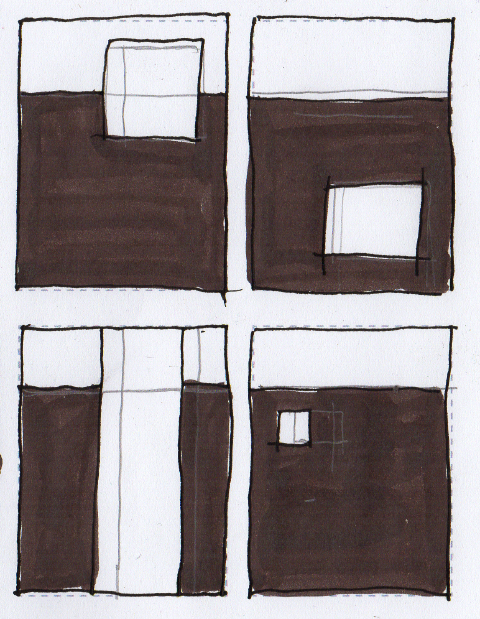
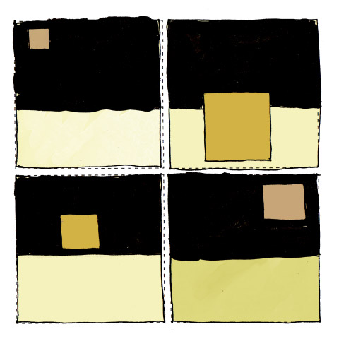
Exercise: 1 square with background
Goal: Define visual structure in four panels
Steps:

1.Define a consistent background shape
2. Use one rectangle and define a rhythm of AND,AND, BUT, THERFORE
3.Use scale and placement only
Outcome: 10 drawings write an evaluation

Squares exercise 2
Categories
Abstract Comics

What makes a comic without any characters.

Comics have characters, places and things, a plot with events no matter how surreal. From Batman to the latest hipster wildness, characters take action in a world. Comics telling those stories is the same practice that Homer engaged in around a fire, the creation of empathy, narrative suspense, and fascination. If you remove the characters, the empathy, the narrative drive traditionalists think there is nothing there. But it’s a rich nothing that has paper, ink, paint, a cartoonist, a reader, pages, things that make a book. Can that basic of a book exist outside of narrative traditions?

haverholm2

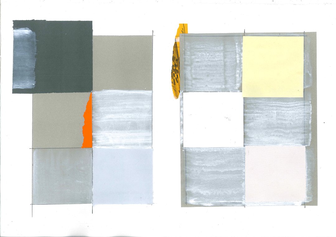
Alan Haverholm’s “When the Last Story is told”, is a 61 page graphic novel. It has no words, a six-panel grid and pages that look like late minimalism, others pages look like action painting, still more are paper and or photo collages.

You can’t consume this like a traditional comic, with no words you can’t even read it. As you you turn pages you have to ask yourself why? In a book, 61 collages become one object. As one object each panel now has a relationship with all the other panels. The first page with juicy thick white paint built over collaged paper declares itself as “Art” these days. A textural stamped black smudge runs out underneath panel 2 and leads the eye to turn the page.

Categories
Abstract Comics Drawing Jack Kirby

Abstraction, just flat design is easy, don’t make everything overlap, representational stuff is simpler, compile some reference , draw what you see, adding overlaps to abstraction, just screws my brain up. Sometimes you get a shape and it seems right, the combination of shape implied space and three dimensionality but not doing representation and I’m happy.

Now if I can just repeat it a hundred times. Comics, harder then every other art form.