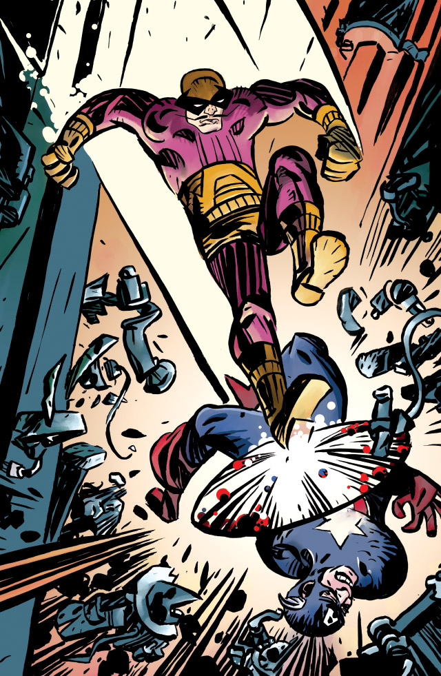
So here’s a drawing of Batroc, done for a benefit book for the Hero Initiative. While it has the usual assortment of Americans it also has Europeans in it so we’ll see how Jacks influence has spread. It should be a fun and interesting book.

They also wanted a short text on my thoughts so I pulled some stuff from the introduction to Abstract Kirby to blab some more
“I’ve read Jack Kirby’s stories for almost fifty years. A Somewhere in the flurry of Kirby’s pages the simplicity of the drawing becomes powerful and emotional. His reduction of form to simple shapes creates the explosive power within the drawing. Within this simple vocabulary, facial storytelling, acting and body gestures smash against his minimalism. Figure angles that most artists would simply skip as too complex seem to flow from his hand. He drew anything. His vocabulary allowed him to take on scenes and draw in a way impossible for almost any artist to conceive of. He didn’t worry about lame panels or bad drawings he just worried about the flow of pages.
As amazing as his great panels are it’s the flow of his stories that makes the real magic for me. The interrelationship of how panel to panel pulses with energy, closer to DeKooning and Pollack then representational art, seems to be lost from comics today.
His storytelling is a photography’s ability to catch the angled momentary shot, not the framed, posed composition of a painter. Most comics are stopped and posed as a moment in time. Jack’s panels always push you along to the next panel. By wanting to put a reader totally into his story, the individual drawing isn’t important. Each panel is a set of forces pushing you to the next moment graphically.
Art historians talk about the breakdown of World War 1 leading to complex multiple viewpoints and fractures of Picasso and Braque’s cubism. Matisse, the other giant of the last century might have put it all back together integrating the world into some blissful forms of shapes dancing. Between Matisse and Picasso you could sum up most of the visual trends of the 20th century. Kirby lives in adventure story land between Picasso and Matisse.
Kirby worked in a minimalist grid, probably as a choice to speed the execution of his pages, adapting film/photography cropping of space to tell stories. But the panels are drawn as a whole page within the context of the story, creating a cubist narrative space, larger than anything Picasso could approach. His compressed shape driven drawing becomes as iconic as Matisse’s gestural based shapes. But the grid and the space fractures up the pictorial space into energy flows equivalent to Abstract Expressionism. In the end, Jack’s drawings become more complex than Picasso and Matisse just by the collision of multiple images piled on one another. So I tried to steal that.
Jack probably wasn’t a modernist embracing restraints to create freedom, mimic production or any of the art critics strategies to explain work. By working within a consistent grid of 4 and 6 he gained minutes and had his layouts almost predetermined for him. It was a production and business choice that becomes art. In fact there is exactly 5 panels that break the grid and only 15 panels that use a three panel division of a tier in 385 pages of comics in the first volume of the Fourth World. For Jack panel structure was a grid, the page a larger element in a story, the grid is perhaps the easiest thing to take.
With no panel choices to drive the design, the imagery becomes transcendent be being shapes cut into and out of each other. Then he overlaps and piles things on to each as if almost collaging the moment. All of this, functioning in a deep space that works as flat design to make some kind of narrative cubism.
His form as simple shapes, rendered with brushstrokes starts with Caniff’s black inked based impressionism moves towards iconic work on his own. Especially under Royer’s inking, the flat design of shape creeps in. The almost gestural tension of those drawn brush strokes racing up and down an arm or a leg is so begging to jump into an expressionist painting. In the end Kirby is just Kirby, one of the three greatest artists of the last century, surpassed only by Picasso and Matisse, but maybe not.”

2 replies on “Drawing Batroc”
I really enjoyed your thoughts on Kirby and the grid. His use of the grid is endlessly fascinating to me. I guess, beyond it being a production decision (one less thing to worry about), the grid helped make those stories and ideas easy to digest. I think it also made those stories memorable. In fact, I have found that simple (not simplistic) presentation often makes for a more memorable experience. As an example, for all the pretty moving camera shots in Peter Jackson’s films they are pretty much a blur in my memory, but I can pretty much remember every shot in the original King Kong.
Your right fancy cutting in Movies or comics really screws up the impact of a sequence and pictures. I like having control of color but all the fancy computer painting today sort of screws up the structure and reading of the page.
Although the guy who invented montage Eisenstein was always looking for the striking image not just the most generic one