Jim Shooter has a great rant up on his web site about inking, any young artist should go read it and integrate it into their work.
It shows what made Shooter so successful his ability to analyze what works and describe it in some form. His lecture on storytelling is also wonderful, great basic primers in doing comics, but sometimes he goes a little off, like this…
“Someday, I will find the guy who invented the expression “spotting blacks,” and kill him with my shoe. Spotting blacks—scattering black areas around the panel stupidly? WHAT? There are people who should know better who advocate making an “interesting pattern,” an “abstract design” with the placement of black areas in the panel. They are insane. ”
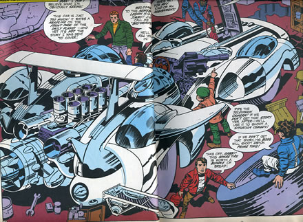
But then I look at a picture like this.

Looking it I say, abstract design, yup, black areas scattered around the panel, yup, intereseting pattern, that too. It makes a guy wonder is Jack Kirby insane, did he know what he was doing? At first looking at this drawing I thought Jack was doing just what Shooter claimed, just spotting blacks to make the page more exciting and energetic. Like I said Shooter is really smart and analytical and knows comics…
but I think Jack knows more then Jim.
Shooter says inking is about creating depth and he looks back to the traditions of the old masters and trots out some art theory to back him up. There’s an interesting book called Moving Pictures by Anne Hollander which explores how movies adapted old masters approaches to lighting and composition which backs Shooter up. Most of the great compositional masters of comics, Toth, Crane, Caniff, and masters of how to set a panel come out of this approach. And I admit I was just at a loss as I look at Jack’s work to understand the logic of Jack’s use of blacks if it isn’t abstract design and interesting pattern.
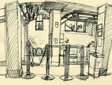
Then my bum ankle went out and I ended up waiting for x-rays one day. So I drew the waiting room. Having just got the new Alex Toth book I was thinking about composition and blacks and how to spot them as I drew. But every place I looked there where blacks just scattered across the room, artificial lights created glowing points of interest, shadows made not a logical bit of sense if you thought in an old masters approach to the space because there was so much artificial light.

My little pea brain went “oh now I get it”. Jack was making an abstract design a visually interesting pattern and he was responding to the use of artificial light in a space, where the depth isn’t set up by natural light sources. To me this is what makes Jacks work so cool, he’s created a visual shorthand to tell stories, he’s doing massively energetic work and he’s still looking at the world and processing it into his work not just drawing the same damn picture over and over again. Like Shooter I’m way to intellectual and analytical on what I do, what I love about Jack’s work is in this emotional and powerful simplification of forms he keeps looking at the world too. Sometime you just gott say it, “Jack really is the King”.