This is a flattened Robbins page to see if I can find the design of the page underneath it. Jack’s use of 2-d design and three-d space is what makes his work unique. Working within his grid Jack would consider the flat shape based design of the page along with the space he was creating. Kirby often seemed to set up suspense that could be carried visually in a page.
Kirby considered each page as a scene with a beginning middle and end that could be told visually.
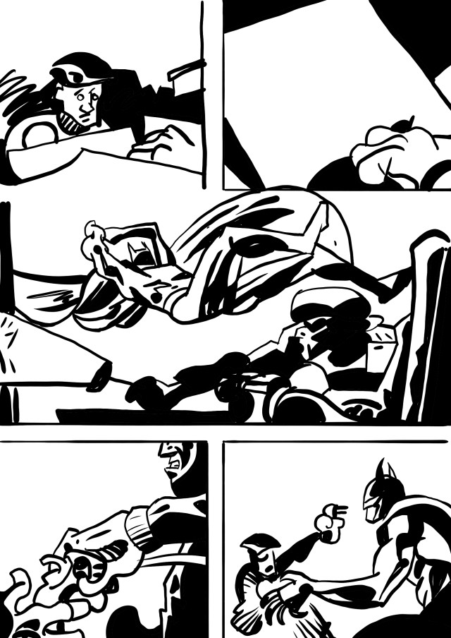
Robbins strings his panels together with no visual narrative. Batman just appears.
We haven’t seen the whole room, but could he swing in that open window when the thief crawled in.
If Batman’s back leg was down and ran behind the thief’s head, it would have been a two dimensional design, that shows Batman attacking the thief. Each individual shape is dynamic, but Batman and the thief have no spatial or design relationship. Batman is in a mostly horizontal position as he swings across the top of the panel.
In panel 4 the thief’s jaw and shoulder are vertical, repeating the same straight up feel of the chair in panel three. Why not eliminate them and have a stronger diagonal as he grabs the gun that could focus on just that small action. Why in panel five is Batman’s hand dropped down instead of held up crossing the figure.
Why trash poor Frank Robbins? I actually love Robbins drawing and was excited to start this and with this I”m beginning to realize why Kirby is the King. His focus and simplification and storytelling within the drawing make his work more dynamic then the other artists working at the same time. While Robbins extended cartooning seems like it should be as dynamic in it’s own way as Kirby’s it’s actually in the brush drawing that make Robbins work provide the jazz and fun of his work.
Robbins painted and made his canvasses look like expressionistic gestural work.In ink you don’t have that ability to lay stokes one over another that paint provides so you have a more basic image. I think with Robbins it’s thinking about brushstrokes and use of black as paint that is the point, not the storytelling and design of panels that exists in Kirby.
One reply on “Robbins just isn’t a brushy Kirby #2”
I’ve long admired Robins work but I realize that most of the appeal is in the brushwork as you state. There is definitely energy in the work and it does move but I never felt that sense of breathlessness that a Kirby story leaves one with. Still, Robbins was a master at his craft and deserves to be revered. As much as I love Caniff I find that Robbins work, particularly his DC comics, has real power. I guess maybe he’s the point between Caniff and Kirby. By the way, the closest to that feeling of “laying down track while the train is rushing forward” effect I’ve ever come across in comics, after Kirby, might be the Nick Fury stories by Steranko that appeared in Strange Tales. That guy could really pack 3 books worth of material into 10 pages. After you read those you would be wound up from the sheer energy.
Apologies for the long comment.