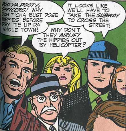
It’s just a little riff of excellence as Jack Kirby cruises through his work this day. Places the talk at the top, juggle six people establish a couple of characters, set the crowd scene throw in some babes, balance it all nicely so you focus on one hunk, hero kind of guy. In it’s mastery it blows away all your nagging little concerns, it does it’s job really well and we get the next frame and go on with our story. 5 minutes of Jack’s time, maybe. Stop, enjoy, and look, you don’t get comics like this any more.
The crowd looks out at the reader in awe because within the story, they are looking at the heroes. The heroes of course are blocking traffic and causing disruption in the flow of normal everyday life. There’s the worker speaking in slang, the small mustached older man, dapper in a pin stripe suit and spectacles, probably an immigrant, nervous and just watching. Two young babes, the Steve Rogers strong silent generic hunk and a forehead and hair placed on the right.
We sigh, at the wimpy generic Colletta lines, how much do we miss because of them? What is not there? What is lost because of the inker? Jack wanted everyone to draw in their own style. Jack invented his own vocabulary, he understood, artists should invent their own vocabulary, that’s a 20th century, modern art idea hammered into the lowest of commercial art forms. You have to wonder if Vinnie ever understood Jack’s work, in the gut, like a Sinnott or Royer? It always feels like Vinnie’s trying to make Jack’s drawing into something it isn’t. Soft, dull, well drawn DC comics. Well drawn being anemic realism that dominated DC then and with the aid of Photoshop gradients has brought van art and brown to every mainstream comic. Jack was leaping into a new experience with almost every panel; Vinnie was just stuck in the realm of plain old comics.
The worker, old guy and blonde babe are filling the left half of the panel, stacked to make space. They crowd it, making it compressed and active. The “Steve Rogers” calm cool collected he gets a wide expanse for the other half of the panel allowing our eye to focus in on him, as he is mildly amused or slightly annoyed. Whenever has a crosshatched suit been used as a rest space in a composition other than Kirby? The second babe is cropped at the edge she’s just there to make the “crowd”. Her chin forms a tangent with “Steve’s” shoulder. The art student in me says “bad Jack, tangents like this are not clear”, she should have been down a little bit or a little higher so the space is clear. The reality is Jack was drawing four pages a day and stuff like that is going to happen, and in the scope of the story, what’s a tiny little tangent?
The for-head in the lower right corner makes me laugh, Jack has created a space, a crowd scene, provided more personality in a throw away panel then he has any right to and he sticks a for-head in, why? Just to push the space a little more, a little more cluttered and New Yorker like, it takes you from the front of the crowd looking at the scene to right into the crowd. It’s this little anchor for your eye to look into the scene and roll on into the next panel. Just a couple of notes but there sweetly played as he stacks the left side, opens up the right so we can focus on one character. Implies the crowd with a little twist. It’s once more, you can take the kid out of the Lower East Side, stick him in California, give him sunshine and palm trees, but New York it’s in Jack’s soul.