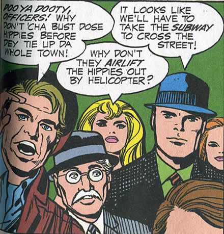
It’s just a little riff of excellence as Jack Kirby cruises through his work this day. Places the talk at the top, juggle six people establish a couple of characters, set the crowd scene throw in some babes, balance it all nicely so you focus on one hunk, hero kind of guy. In it’s mastery it blows away all your nagging little concerns, it does it’s job really well and we get the next frame and go on with our story. 5 minutes of Jack’s time, maybe. Stop, enjoy, and look, you don’t get comics like this any more.
Category: Jack Kirby
Abstraction, just flat design is easy, don’t make everything overlap, representational stuff is simpler, compile some reference , draw what you see, adding overlaps to abstraction, just screws my brain up. Sometimes you get a shape and it seems right, the combination of shape implied space and three dimensionality but not doing representation and I’m happy.
Now if I can just repeat it a hundred times. Comics, harder then every other art form.
Who’s Stronger Toth or Kirby?
There’s been some very nice analytical articles on Alex Toth lately , by Jesse Hamm and Paul Fricke occasioned by some great reprint books and the bio of him, and it’s been making me wonder about focusing on Jack Kirby’s work, Toth is such a more elegant artist then Kirby, every line is literally a precise controlled thought out line. He’s a much finer craftsman then Jack meticulously telling his stories and relentlessly experimenting with the comics form and being an artist. But in the end Kirby’s work is more emotionally satisfying and powerful to me then Toth’s.
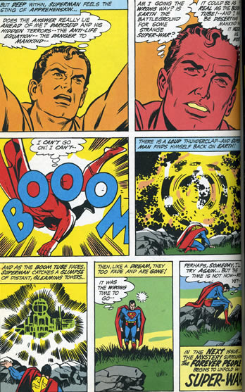
It’s hard saying drawing doesn’t matter in comics, so it’s hard to ignore how Jack’s work gets destroyed. The last page of Forever People 1 is one of those pages that makes you want to cry that Mike Royer wasn’t inking it. But lets look at Jack’s layouts.